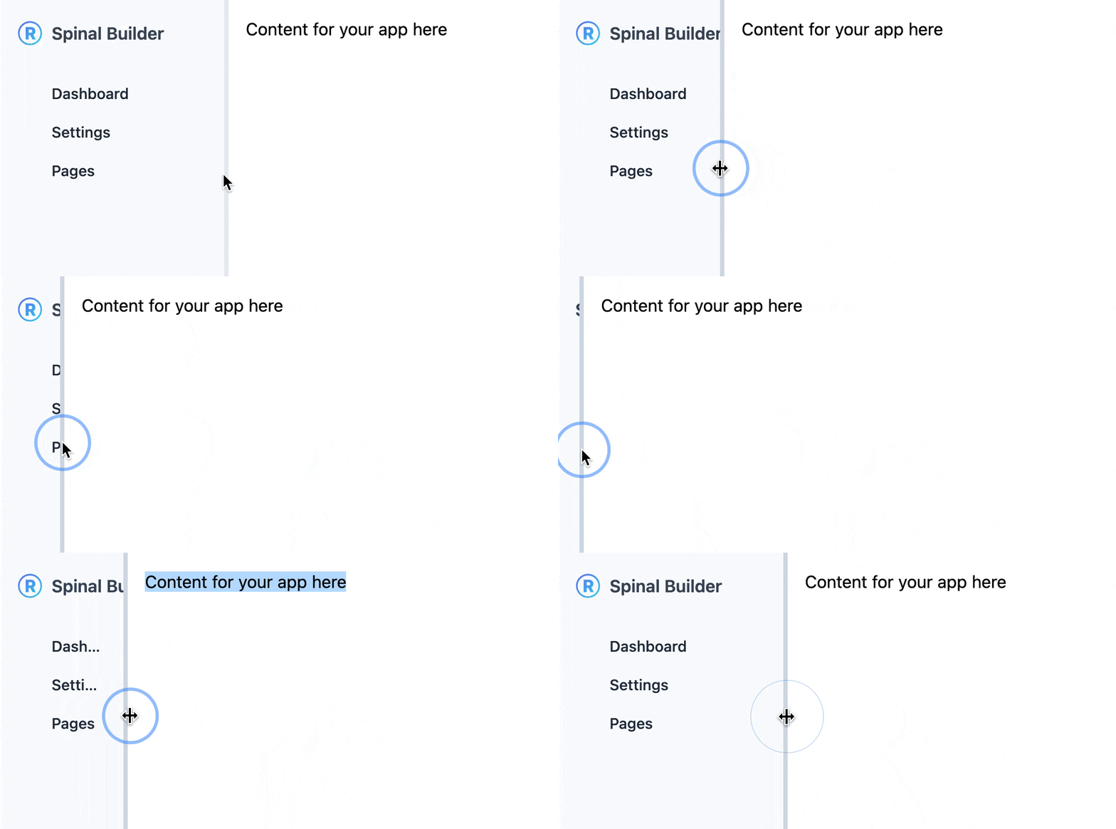
Create a Resizable Navigation with Stimulus
If your app has a sidebar navigation, which is quite common with most screens being wide enough to support these days, making it resizable might be a great feature to add. Giving this customization allows your users to tweak the screen for the task at hand. Maybe they want to focus on writing their next big piece or maybe they split their screen, making the default width a bit too wide.

Whatever the reason, resizing the sidebar navigation (or any other component) is easy with JavaScript and thus with Stimulus. Let’s dive right in. Let’s set up the basics in HTML:
<div data-controller="resize" data-action="mousemove@window->resize#set mouseup@window->resize#stop" class="relative">
  <nav data-resize-target="panel">
    <!-- Imagine some nav items here -->
  </nav>

  <div data-action="mousedown->resize#start" class="absolute top-0 right-0 z-10 w-2 h-full bg-gray-500 cursor-ew-resize"></div>
</div>
Above HTML is using Tailwind CSS classes, but that’s not required for this example. You can style it using vanilla JS as well.
Notice the mousemove@window and mouseup@window? That is adding those two event listeners to the window, not, what is more common, to the current target. Now the stimulus controller. It’s surprisingly simple.
import { Controller } from "@hotwired/stimulus"

// Connects to data-controller="resizer"
export default class extends Controller {
  static targets = ["panel"];
  static values = { isResizing: { type: Boolean, default: false } };

  start() {
    this.isResizingValue = true;
  }

  stop() {
    this.isResizingValue = false;
  }

  set(event) {
    if (!this.isResizingValue) { return; }

    this.panelTarget.style.width = `${this.panelTarget.offsetWidth + event.movementX}px`;
  }
}
What’s going on here? If you checked out the HTML, you should already have a feel for it (the beauty of Stimulus), but let’s disect it:
- when you “mousedown” on the handler, the
startfunction is invoked that setsisResizingtotrue; - when you “mouseup”, the value is set to
false; - then whenever you “mousemove”, the width of the
panelTargetis set, but only ifisResizingValuereturns true.
If you head over to your browser, you are now able to resize the navigation. If you want to constrain the width, you can simply add a max-width CSS property.
Awesome! 🥳 That’s all you need to resize an element in your app using Stimulus. From here you can improve by storing the value in the user’s settings (eg. via Redis) to be the same across browsers or store it in browser’s LocalStorage to store it for that session (Rails Designer helps you by providing JS utilities for that) or check out this article on storing UI state in localStorage.
Want to read me more?
-
Store UI State in localStorage with Stimulus
Easily store user preferences in the browser's localStorage using Stimulus. -
Build a Notion-like editor with Rails, part 2
In part 2 of building a Notion-like editor, let's use Hotwire (Stimulus and Turbo Streams) to get the actual editor functionality in place. -
Simple accordion without JavaScript
You don't need JavaScript for many modern UI components. The accordion is a classic example. Let's explore how it's done.
Over to you…
What did you like about this article? Learned something knew? Found something is missing or even broken? 🫣 Let me (and others) know!
Comments are powered by Chirp Form
{{comment}}