Conditionally Style Turbo Frame Content
I like to explore a little technique I have been using for some time to reuse HTML and change it styles based if it is shown in a turbo-frame or not.
For inspiration I am going to use Letterboxd log in flow.

I assume you have an up-to-date Rails app ready with Hotwire set up. This example is also using Tailwind CSS.
Let’s create the navigation component first (partial at app/views/shared/_navigation.html.erb).
<div class="w-full max-w-2xl py-40 mx-auto">
  <nav class="flex items-center justify-between px-6 py-2.5 bg-white/70 backdrop-blur-md rounded-md shadow-xl ring-1 ring-offset-0 ring-gray-200">
    <%= link_to "Rails Designer", "#", class: "font-bold tracking-tight text-gray-900" %>

      <ul class="flex items-center gap-6">
        <li>
          <%= link_to "Log In", new_session_path, class: "text-sm font-medium text-gray-900 hover:text-sky-600" %>
        </li>

        <li>
          <%= link_to "Pricing", "/pricing/", class: "text-sm font-medium text-gray-900 hover:text-sky-600" %>
        </li>

        <li>
          <%= link_to "Docs", "/docs/", class: "text-sm font-medium text-gray-900 hover:text-sky-600" %>
        </li>
      </ul>
  </nav>
</div>
It should look like this:

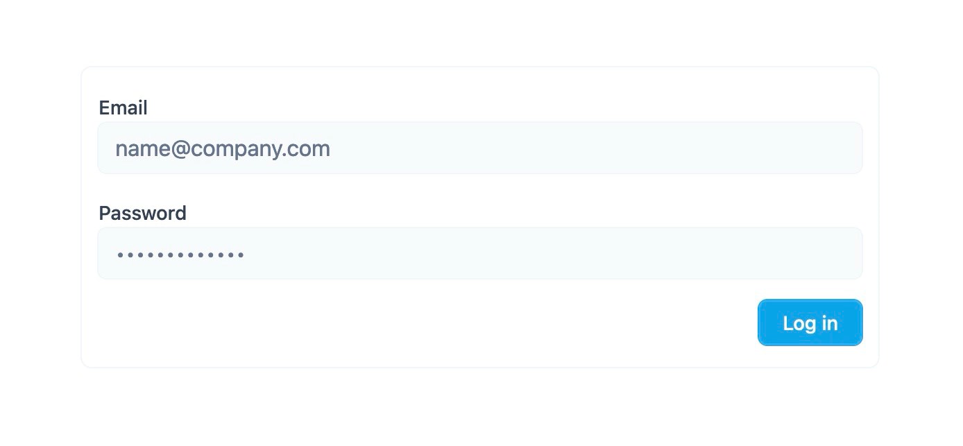
Then the log in form. Let’s create it at app/sessions/new.html.erb. Make sure you have added resources :sessions, only: %w[new] in config/routes.rb.
<div class="max-w-xl px-3 py-4 mx-auto border border-gray-100 rounded-lg">
  <%= turbo_frame_tag "login" do %>
    <%= form_with model: Session.new, url: sessions_path, class: "flex flex-col gap-y-4" do |form| %>
      <div>
        <%= form.label "email", class: "text-sm text-gray-700 font-medium" %>

        <%= form.email_field :email, placeholder: t("placeholders.email"), autocomplete: "email", class: "w-full px-3 py-1.5 text-sm text-gray-800 bg-gray-50 border-0 outline outline-1 outline-offset-0 outline-gray-100 rounded-md" %>
      </div>

      <div>
        <%= form.label "password", class: "text-sm text-gray-700 font-medium" %>

        <%= form.password_field :password, autocomplete: "current-password", placeholder: "•••••••••••••", class: "w-full px-3 py-1.5 text-sm text-gray-800 bg-gray-50 border-0 outline outline-1 outline-offset-0 outline-gray-100 rounded-md" %>
      </div>

      <div>
        <%= form.submit "Log In" %>
      </div>
    <% end %>
  <% end %>
</div>
So now when you click the Log In button in the navigation you are directed to the sessions#new view.

With these basics in place, it’s time to add the good stuff.
First wrap the form it in a turbo-frame tag.
<div class="w-full max-w-2xl py-40 mx-auto">
  <nav class="flex items-center justify-between px-6 py-2.5 bg-white/70 backdrop-blur-md rounded-md shadow-xl ring-1 ring-offset-0 ring-gray-200">
    <%= link_to "Rails Designer", "#", class: "font-bold tracking-tight text-gray-900" %>

    <%= turbo_frame_tag "login" do %>
      <ul class="flex items-center gap-6">
        <!-- … -->
      </ul>
    <% end %>
  </nav>
</div>
And also wrap the form in a turbo-frame.
<div class="max-w-xl px-3 py-4 mx-auto border border-gray-100 rounded-lg">
  <%= turbo_frame_tag "login" do %>
    <%= form_with model: Session.new, url: sessions_path, class: "" do |form| %>
      <%# … %>
    <% end %>
  <% end %>
</div>
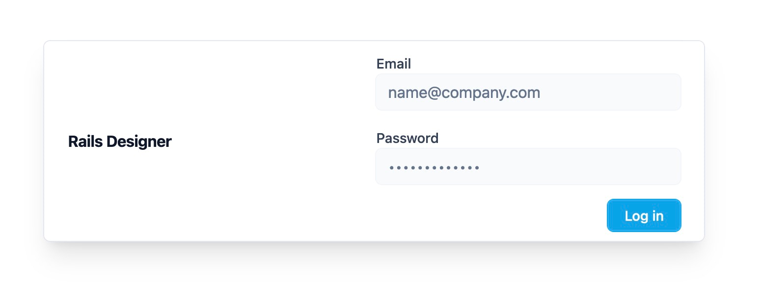
Now when you click the Log In button it loads the form inline. Close, but it looks like pretty bad!

So let’s make some tweaks to the form to fix that. But before that, a custom Tailwind CSS plugin is needed. No worries, it’s really simple.
// tailwind.config.js
module.exports = {
  plugins: [
    // …
    function ({ addVariant }) {
      addVariant("turbo-frame", "turbo-frame[src] &")
    }
  ]
}
This adds a custom CSS variant named frame that targets elements within a Turbo Frame with a src attribute. This means HTML can now be styled based if its within a turbo-frame, like so shadow-sm turbo-frame:shadow-none.
Let’s tweak the sessions#new to use this new plugin.
<div class="max-w-xl px-3 py-4 mx-auto border border-gray-100 rounded-lg">
  <%= turbo_frame_tag "login" do %>
    <%= form_with model: Session.new, url: sessions_path, class: "flex flex-col gap-y-4 gap-x-2 turbo-frame:flex-row turbo-frame:items-end" do |form| %>
      <div>
        <%= form.label "email", class: "text-sm text-gray-700 font-medium turbo-frame:sr-only" %>

        <%= form.email_field :email, placeholder: t("placeholders.email"), autocomplete: "email", class: "w-full px-3 py-1.5 text-sm text-gray-800 bg-gray-50 border-0 outline outline-1 outline-offset-0 outline-gray-100 rounded-md" %>
      </div>

      <div>
        <%= form.label "password", class: "text-sm text-gray-700 font-medium turbo-frame:sr-only" %>

        <%= form.password_field :password, autocomplete: "current-password", placeholder: "•••••••••••••", class: "w-full px-3 py-1.5 text-sm text-gray-800 bg-gray-50 border-0 outline outline-1 outline-offset-0 outline-gray-100 rounded-md" %>
      </div>

      <div>
        <%= form.submit "Log In" %>
      </div>
    <% end %>
  <% end %>
</div>
And now when you click Log In the inline form looks quite different compared to the standalone screen. Neat right?

This example only shows some minimal tweaks made to the form, from putting the fields on one row to hiding the form labels (for non-screen readers), but I think you can imagine the amount of tweaks you could make.
Want to read me more?
-
Quicktips for ViewComponent with Tailwind CSS/Hotwire
Write cleaner, better and more maintainable with ViewComponent and Tailwind CSS. These tips and tricks come straight from real, production Rails apps. -
Use cases for Turbo's Custom Events
Many actions from Turbo send custom events before and upon completion. You can use this to your advantage. -
How to create Modals with Rails and Hotwire (and Tailwind CSS)
Creating modals in Rails with Hotwire (and Tailwind CSS) is a straightforward process. Let's go through the process step by step.
Over to you…
What did you like about this article? Learned something knew? Found something is missing or even broken? 🫣 Let me (and others) know!
Comments are powered by Chirp Form
{{comment}}