Create a macOS-inspired stack UI with Stimulus and Tailwind CSS
The other day I accidentally enabled the “fan” option in my dock’s application folder (I have it normally set to just “list”). But this incident inspired me to recreate the effect in Rails with a simple Stimulus controller and lots of Tailwind CSS goodies.
An early reader of this article mentioned that Hey uses a similar effect for their “trays”
It made for a good case to show how much can be done with (Tailwind-flavored) CSS. And while this article uses Tailwind CSS, it can be easily replicated with just CSS. 💡
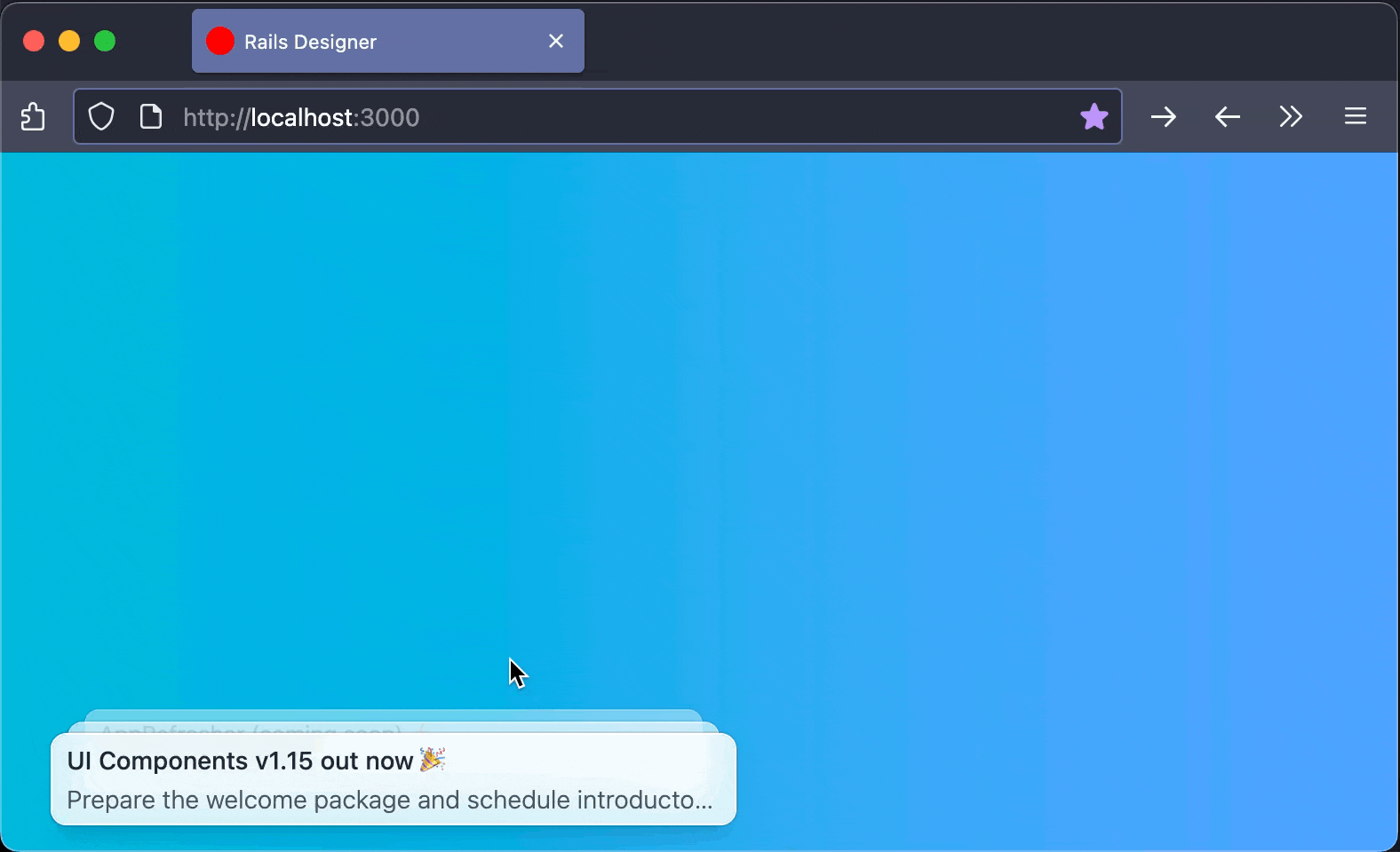
This is the component I am aiming for:
What will be covered in this article:
- Tailwind CSS grouping;
- Data variants with group modifiers;
- Using Stimulus FX for the
whenOutsidecustom action.
As often the code can be found in the Github repo. 🚀
Let’s go!
The foundation
First, let’s quickly go over the foundation to understand how the simple data model works to display cards (it is not a typical Active Record model).
# app/models/card.rb
class Card
  include ActiveModel::Model

  attr_accessor :subject, :description
end
The PagesController creates a few sample cards:
# app/controllers/pages_controller.rb
def show
  @cards = [
    Card.new(subject: "UI Components v1.15 out now 🎉",
             description: "Prepare the welcome package and schedule introductory sessions"),
    Card.new(subject: "AppRefresher (coming soon) ⚡",
             description: "AI-powered tool to keep your knowledge base articles images/screenshots up-to-date"),
    Card.new(subject: "In beta now: Helptail 🏗️",
             description: "A visual workflow builder that connects to any API, allowing you to automate repetitive tasks like drafting newsletters or publishing scheduled content (think a more developer-focused Zapier)")
  ]
end
And a simple card partial to render each card:
<!-- app/views/cards/_card.html.erb -->
<li>
  <%= link_to "#" do %>
    <h5>
      <%= card.subject %>
    </h5>

    <p>
      <%= card.description %>
    </p>
  <% end %>
</li>
The view simply renders these cards in an unordered list:
<!-- app/views/pages/show.html.erb -->
<ul>
  <%= render @cards %>
</ul>
The Canvas
The first step is to create a visually appealing background and style the cards. Let’s start by adding a gradient (taken from the Tailwind CSS gradients tool) to the body:
<!-- app/views/layouts/application.html.erb -->
<body class="bg-gradient-to-r from-cyan-500 to-blue-400">
  <main class="container mx-auto mt-28 px-5 flex">
    <%= yield %>
  </main>
</body>
Next, let’s update the pages#show structure to position the cards at the bottom of the screen:
<!-- app/views/pages/show.html.erb -->
<div class="fixed bottom-4 w-full max-w-sm">
  <ul class="relative grid gap-4">
    <%= render @cards %>
  </ul>
</div>
Now, let’s style the cards to make them look good. The cards should be stacked on top of each other when collapsed:
<!-- app/views/cards/_card.html.erb -->
<li class="bottom-0 w-full px-2 py-1 bg-white/80 backdrop-blur-sm border-0.5 border-white/70 ring ring-1 ring-offset-1 ring-black/10 rounded-lg shadow-lg hover:ring-black/20 transition-all duration-300 ease-in-out hover:scale-101 absolute">
  <%= link_to "#" do %>
    <h5 class="text-sm font-medium text-gray-800">
      <%= card.subject %>
    </h5>

    <p class="mt-0.5 text-sm font-light text-gray-600 text-base line-clamp-1">
      <%= card.description %>
    </p>
  <% end %>
</li>
At this point, the cards look good individually, but they’re all positioned absolutely in the same place. The next step is to use Rails’ class_names helper to position them based on their order.
Using Rails’ class_names helper with data variants
Now it’s time to introduce the class_names helper to conditionally apply classes based on the card’s position in the stack:
<!-- app/views/cards/_card.html.erb -->
<%= tag.li class: class_names(
  "bottom-0 w-full px-2 py-1 bg-white/80 backdrop-blur-sm border-0.5 border-white/70 ring ring-1 ring-offset-1 ring-black/10 rounded-lg shadow-lg hover:ring-black/20",
  "transition-all duration-300 ease-in-out hover:scale-101",
  "absolute",
  {
    "scale-100 translate-y-0": card_counter == 2,
    "scale-95 opacity-75 -translate-y-2": card_counter == 1,
    "scale-90 opacity-50 -translate-y-4": card_counter == 0,
  }) do %>
  <%= link_to card.url, class: "block" do %>
    <h5 class="text-sm font-medium text-gray-800">
      <%= card.subject %>
    </h5>

    <p class="mt-0.5 text-sm font-light text-gray-600 text-base line-clamp-1">
      <%= card.description %>
    </p>
  <% end %>
<% end %>
This creates a stacked effect where each card is slightly smaller, more transparent and positioned higher than the one below it. Oh, see the card_counter == * logic? It’s a feature from Rails’ partials. I explored it, along with many other features, in the article about Rails’ Partial Features You (Didn’t) Know.
Get more than 200 Rails UI Components
Rails Designer's UI components is an UI components libraray used by 1,000+ developers globally to build their next project.
Simple Stimulus Controller
Now let’s add a Stimulus controller to handle the show/hide functionality:
// app/javascript/controllers/cards_controller.js
import { Controller } from "@hotwired/stimulus"

export default class extends Controller {
  static values = {
    open: { type: Boolean, default: false }
  }

  show() {
    this.openValue = true
  }

  hide() {
    this.openValue = false
  }
}
Then update the HTML to use this controller:
<!-- app/views/pages/show.html.erb -->
<div class="fixed bottom-4 w-full max-w-sm">
  <ul
    data-controller="cards"
    data-cards-open-value="false"
    data-action="click->cards#show"
    class="relative grid gap-4 group/cards"
  >
    <%= render @cards %>
  </ul>
</div>
Now update the card partial to use the group data variants:
<!-- app/views/cards/_card.html.erb -->
<%= tag.li class: class_names(
  "bottom-0 w-full px-2 py-1 bg-white/80 backdrop-blur-sm border-0.5 border-white/70 ring ring-1 ring-offset-1 ring-black/10 rounded-lg shadow-lg hover:ring-black/20",
  "transition-all duration-300 ease-in-out hover:scale-101",
  "group-data-[cards-open-value=false]/cards:absolute group-data-[cards-open-value=true]/cards:origin-bottom-right",
  {
    "group-data-[cards-open-value=false]/cards:scale-100 group-data-[cards-open-value=false]/cards:translate-y-0 group-data-[cards-open-value=true]/cards:rotate-0": card_counter == 2,
    "group-data-[cards-open-value=false]/cards:scale-95 group-data-[cards-open-value=false]/cards:opacity-75 group-data-[cards-open-value=false]/cards:-translate-y-2 group-data-[cards-open-value=true]/cards:translate-x-2 group-data-[cards-open-value=true]/cards:rotate-2": card_counter == 1,
    "group-data-[cards-open-value=false]/cards:scale-90 group-data-[cards-open-value=false]/cards:opacity-50 group-data-[cards-open-value=false]/cards:-translate-y-4 group-data-[cards-open-value=true]/cards:translate-x-4 group-data-[cards-open-value=true]/cards:rotate-4": card_counter == 0,
  }) do %>
  <%= link_to card.url do %>
    <h5 class="text-sm font-medium text-gray-800">
      <%= card.subject %>
    </h5>

    <p class="mt-0.5 text-sm font-light text-gray-600 text-base line-clamp-1">
      <%= card.description %>
    </p>
  <% end %>
<% end %>
Using Stimulus FX for the whenOutside Custom Action
To detect clicks outside our card stack, the Stimulus FX package needs to be installed. First, add it to the importmap ./bin/importmap pin stimulus-fx.
Then register it in the application:
// app/javascript/controllers/application.js
import { Application } from "@hotwired/stimulus"
+ import { registerActionOptions } from "stimulus-fx";

const application = Application.start()
+ registerActionOptions(application);
Stimulus FX is a package I built that provides additional action modifiers for Stimulus controllers. One of these modifiers is whenOutside, which checks if a click event occurred outside a specific element.
Update the HTML to use the whenOutside action modifier:
<!-- app/views/pages/show.html.erb -->
<div class="fixed bottom-4 w-full max-w-sm">
  <ul
    data-controller="cards"
    data-cards-open-value="false"
-    data-action="click->cards#show"
+    data-action="click->cards#show click@window->cards#hide:stop:whenOutside"
    class="relative grid gap-4 group/cards"
  >
    <%= render @cards %>
  </ul>
</div>
Fixing a bug
There’s a problem: when the cards are stacked (closed), clicking on a card should open the stack, but the cards are links, so clicking would navigate away. To solve this, the pointer-events-none Tailwind CSS utility class can be used:
- <%= link_to card.url class: "block" do %>
+ <%= link_to card.url, class: "block group-data-[cards-open-value=false]/cards:pointer-events-none" do %>
    <h5 class="text-sm font-medium text-gray-800">
      <%= card.subject %>
    </h5>

    <p class="mt-0.5 text-sm font-light text-gray-600 text-base line-clamp-1">
      <%= card.description %>
    </p>
  <% end %>
The CSS pointer-events property specifies whether an element can be the target of mouse events. By setting it to none, the browser is instructed to “ignore” this element for mouse events and let them pass through to elements underneath. Cool, right? Previously you surely would have reached for JavaScript to solve this. 🤓
And there you have it. With just a bit of HTML, CSS and a simple Stimulus controller, a beautiful macOS Dock-style fan UI has been created. Hopefully this example demonstrates how powerful modern (Tailwind-flavored) CSS can be as the entire UI effect is achieved mostly through CSS, with minimal JavaScript needed only for state management. ❤️
Want to read me more?
-
Extending the Kanban board (using Rails and Hotwire)
This article extends the previous kanban board with adding cards and columns and moving multiple cards at once. -
Create a Kanban board with Rails and Hotwire
Build a Kanban board with columns and cards with Rails and Hotwire. -
Announcing Stimulus FX
Announcing a new, small package called Stimulus FX. A cute package to get custom action options in your Stimulus controller for free.
Over to you…
What did you like about this article? Learned something knew? Found something is missing or even broken? 🫣 Let me (and others) know!
Comments are powered by Chirp Form
{{comment}}