Rails UI Components Library Tips and Tricks
Rails Designer is the first UI component library built for modern SaaS apps built with ViewComponent, designed with Tailwind CSS and enhanced with Hotwire. Launched earlier in 2024 it has seen, next to a huge amount of components and variants, many great quality of life improvements too.
I want to highlight a few of these features that are more than components, but that surely will help you build your next SaaS app in Rails.
When you install Rails Designer an initializer is created. This holds the most important configuration to make Rails Designer’s components truly yours.
Customize colors
Tailwind CSS comes with a huge color palette. The full rainbow is available among some nice gray colors. Typically you use one of the grays for the “chrome” of the app.
You can choose which color to use in your components as the primary color (default is sky) and which gray (gray is the default) you want to use.
RailsDesigner.configure do |config|
  # …
  config.primary_color = "red"
  config.gray_color = "stone"
  # …
end
Generate component from library
Initially the only way to generate the components for your app was to run the included generator, eg. bin/rails generate rails_designer:component Elements::Badge. But did you know you also generate the component straight from the library?
Configuration
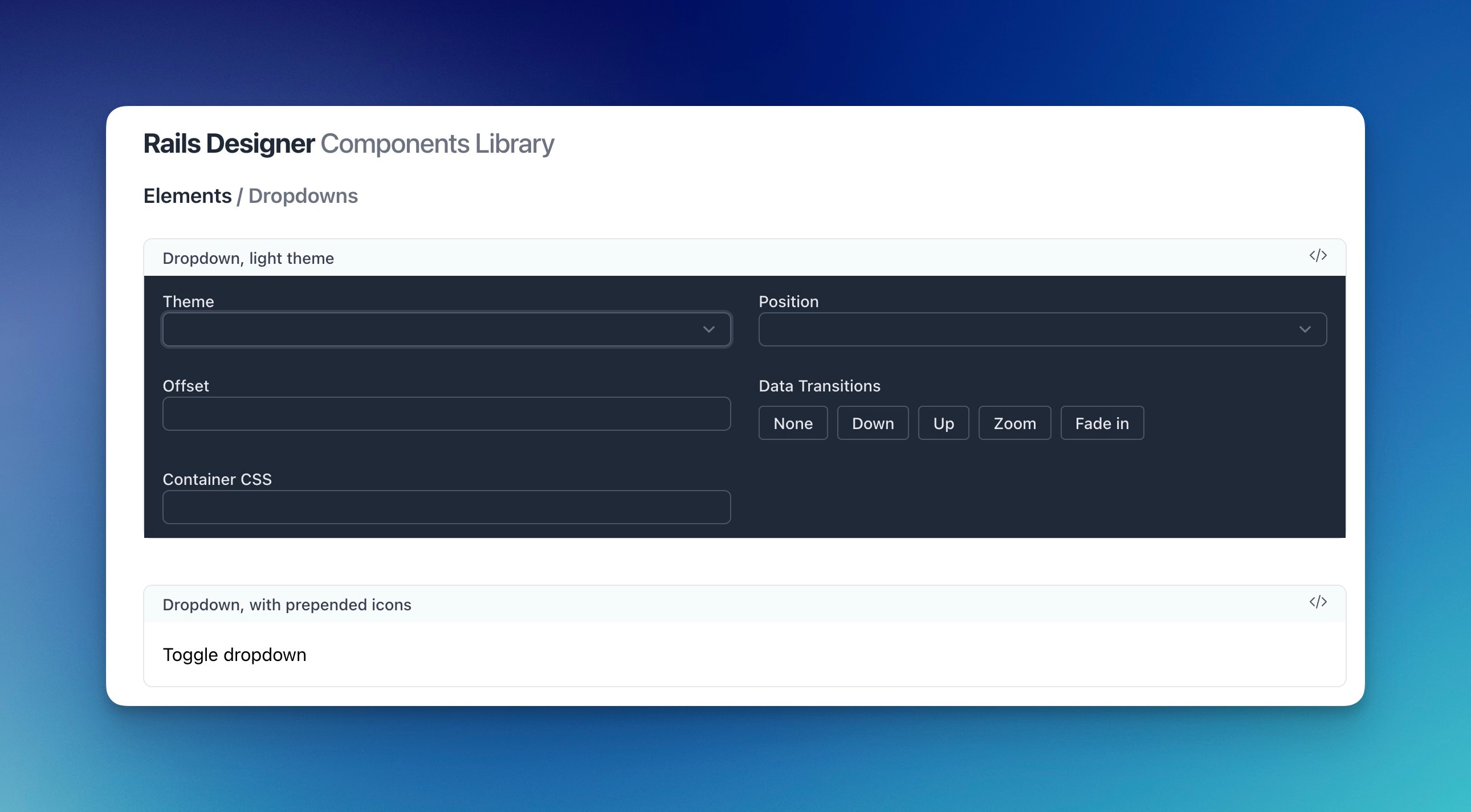
Many components hold many different options. For example: what the position should be for the DropdownComponent or TooltipComponent. But also more fancy stuff like the transitions component appear and disappear from screen.
Just go into the component’s configuration to set each option.
Icons
Rails Designer comes packaged with the, optional, rails_icons gem. By default it uses the Heroicons icon set. But Rails Icons has support for any icon library by design! Note that Rails Designer’s components and variants are built using Heroicons, so you might need to manually replace an icon if it does not exist in your library of choice.
View helpers
Rails Designer comes packaged with a few (ha!) View helpers. They help you keep your code clean and readable. From slimming-down the way components are added to a dedicated stream_notification helper.
See all available view helpers.
Utilities
Next to the View Helpers, there are various utilities that range from simple Stimulus controllers to JavaScript helpers to a generator for nested attributes.
See all available utilities here.
And there you have it. Some lesser known features from Rails Designer, ready to help you build beautiful apps, faster.
Want to read me more?
-
Rails Icons 1.0.0 is here
You don't need JavaScript for many modern UI components. The accordion is a classic example. Let's explore how it's done. -
The missing UI Components Library for Rails: Introducing Rails Designer
Rails Designer has launched. Get UI components for your Rails app using ViewComponent, Tailwind CSS and Hotwire. -
Free Icon Libraries for Rails Apps
A list of the most popular, free icon libraries you can use in your Ruby on Rails app.
Over to you…
What did you like about this article? Learned something knew? Found something is missing or even broken? 🫣 Let me (and others) know!
Comments are powered by Chirp Form
{{comment}}