Multiple component variants with Tailwind
One thing vanilla CSS does really well is extensibility. A good and common, example of this is a button. With plain CSS you can build a base btn class and then a modifier btn-primary (or btn--primary to be BEM-like).
With Tailwind this is less easy to do, unless you use some sort of component system, like ViewComponent. Let’s build just that today, so in your app you can write render ButtonComponent.new.with_content "Save" or render ButtonComponent.new(variant: "danger").with_content "Delete". No dependencies needed, only what Rails gives you.
Let’s set up the basics:
class ButtonComponent < ApplicationComponent
  def initialize(variant: "primary")
    @variant = variant
  end

  def call
    tag.button content, class: classes
  end

  private

  def classes
    "inline-flex items-center px-3 py-2 text-sm font-medium text-white bg-blue-500 rounded-xs"
  end
end
That’s your typical button component. Let’s make use of the @variant variable now.
class ButtonComponent < ApplicationComponent
  def initialize(variant: "primary")
    @variant = variant.inquiry
  end

  # …

private

  def classes
    class_names(
      "inline-flex items-center px-3 py-2 text-sm font-medium rounded-xs",
      {
        "text-white bg-blue-500": @variant.primary?
      }
    )
  end
end
First inquiry is called on the @variant variable. I’ve written this article on inquiry, so be sure to check it out for all the details. Than in the classes method, I am using class_names. For the class_names helper I’ve also written a separate article.
The classes method is where everything comes together. You can see how clean having multiple variants is when the list is extended:
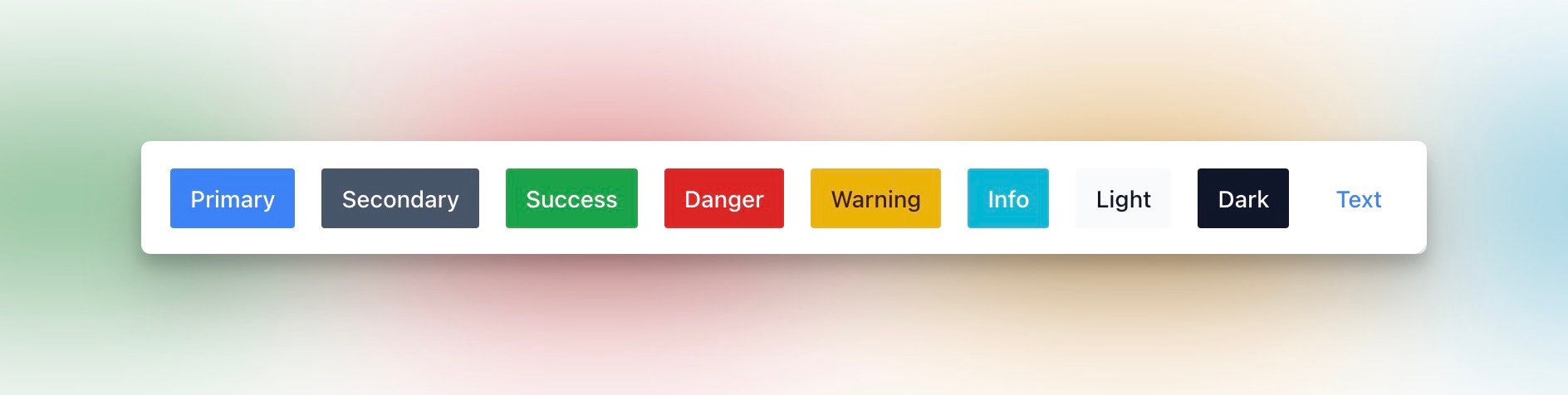
  def classes
    class_names(
      "inline-flex items-center px-3 py-2 text-sm font-medium rounded-xs",
      {
        "text-white bg-blue-500": @variant.primary?,
        "text-white bg-gray-600": @variant.secondary?,
        "text-white bg-green-600": @variant.success?,
        "text-white bg-red-600": @variant.danger?,
        "text-yellow-950 bg-yellow-500": @variant.warning?,
        "text-white bg-cyan-500": @variant.info?,
        "text-gray-900 bg-gray-50": @variant.light?,
        "text-white bg-gray-900": @variant.dark?,
        "text-blue-500 bg-transparent": @variant.text?
      }
    )
  end
This is how they all look:
Next steps
If you want to use this component in your app, there are a few things you might want to add like:
- a
typevariable, so you can use this a submit-button in forms; - any other options, eg.
@options = options, then using the double-splat (**options) when passing it to the button element.
Simple and easy, right?
Want to read me more?
-
Two products, one Rails codebase
Build multiple products from a single Rails codebase using variants and custom configuration class. -
Modern CSS organization (in Rails)
Modern CSS is getting really good. Here are some highligts on how the CSS is organized in Forge (private community app). -
Quicktips for ViewComponent with Tailwind CSS/Hotwire
Write cleaner, better and more maintainable with ViewComponent and Tailwind CSS. These tips and tricks come straight from real, production Rails apps.
Over to you…
What did you like about this article? Learned something knew? Found something is missing or even broken? 🫣 Let me (and others) know!
Comments are powered by Chirp Form
{{comment}}