Build a changelog widget (with Perron)
Changelog widgets, like those from Headway and Beamer, are still a popular way to tell your users about updates to your product. What if you could build one yourself?
Perron, the Rails-based SSG, has a library of production-ready custom elements. One of them, the Embed Content component is perfect for this exact use case. It fetches JSON data, renders it as a list, tracks read state and handles all the UI interactions. You just provide the data.
The result will look like this:
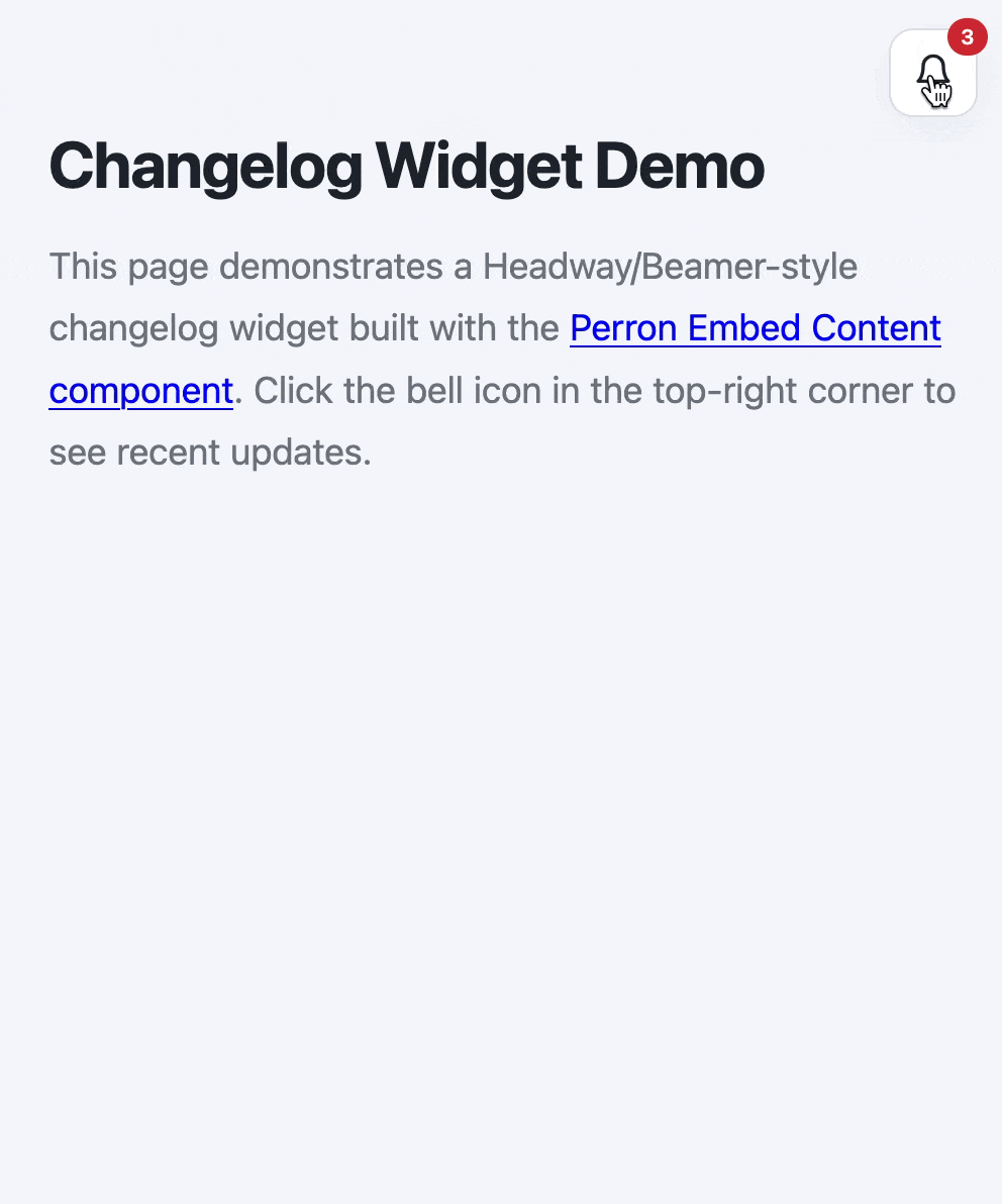
Pretty smooth, right?
Most changelog services lock you into their platform. You pay per seat, deal with their branding and accept their feature set. If you want something simpler or more tailored to your product, you’re stuck building it from scratch.
But here’s the thing: a changelog widget isn’t complicated. It needs to fetch some data, display it nicely, track which items users have read and maybe show a badge with unread counts. That’s it. The Embed Content component is a custom element that fetches JSON from any endpoint, renders items with a template you control, tracks unread state based on a last-read-at timestamp, shows an unread badge automatically and handles open/close toggle states.
You drop it into your HTML, point it at your changelog endpoint and it works. You write the changelog entries in your Perron site (where they are also published. Win-win! 🏆).
Getting Started
First, add the Embed Content component to your project. The setup instructions are straightforward: run the template in your app and the custom element is ready to use.
Next, you’ll need a JSON feed. Perron makes this easy: check out the Perron docs to see how to create a custom template that outputs your changelog items as JSON.
Once your feed is live, drop the Embed Content component into your view:
<embed-content id="changelog-widget" src="https://example.com/changelog.json" limit="5" last-read-at="2026-03-20T00:00:00Z">
  <button aria-label="Toggle changelog">
    <svg xmlns="http://www.w3.org/2000/svg" width="20" height="20" viewBox="0 0 24 24" fill="none" stroke="currentColor" stroke-width="2" stroke-linecap="round" stroke-linejoin="round">
      <path d="M6 8a6 6 0 0 1 12 0c0 7 3 9 3 9H3s3-2 3-9"/>
      <path d="M10.3 21a1.94 1.94 0 0 0 3.4 0"/>
    </svg>

    <span badge></span>
  </button>

  <div panel>
    <div header>
      <h2>What's new</h2>
    </div>

    <ul items></ul>
  </div>
</embed-content>
The component reads the src attribute, fetches your JSON and renders each item. The limit attribute controls how many items show. The last-read-at attribute tracks which items are new: anything published after that timestamp gets marked as unread and counted in the badge.
Your feed doesn’t have to come from Perron. The component just needs JSON with title, body, url and published_at fields. You could use a custom Rails endpoint, a headless CMS or any JSON API. The pattern is the same.
The component uses semantic HTML and CSS custom properties, so styling is straightforward. You control the colors, spacing and layout. This pattern works for any feed-like feature: product announcements, status updates, notification centers or feature releases. The Embed Content component handles the hard parts. You focus on your content. ✨
Check out the example repository for the complete example including CSS.
Want to read me more?
-
Perron 1.0 here is here
Perron 1.0 is here. Nine months in the making, packed with powerful features like programmatic SEO, live reload with DOM morphing and feeds out of the box. -
Introducing Perron: Rails-based static site generator
Introducing a new, OSS static site generator based on Rails: Perron. Build your next static site using the framework you love. -
Creating a Simple Embeddable JavaScript Widget (for Your Rails App)
This articles explores how to create a basic JavaScript widget (for example for chat or documention) to embed on sites and apps.
Over to you…
What did you like about this article? Learned something knew? Found something is missing or even broken? 🫣 Let me (and others) know!
Comments are powered by Chirp Form
{{comment}}