Simple accordion without JavaScript
It’s no secret that HTML and CSS has gotten a lot better over the years. And while I have become to enjoy writing JavaScript, whenever I can get away with it, I do.
One of those things that don’t need JavaScript is the typical accordion. It’s the kind of component that is simple to create with JS frameworks like Vue, Alpine and Stimulus, but for the most basic version you don’t need any of them. And to make them look good all you need is CSS.
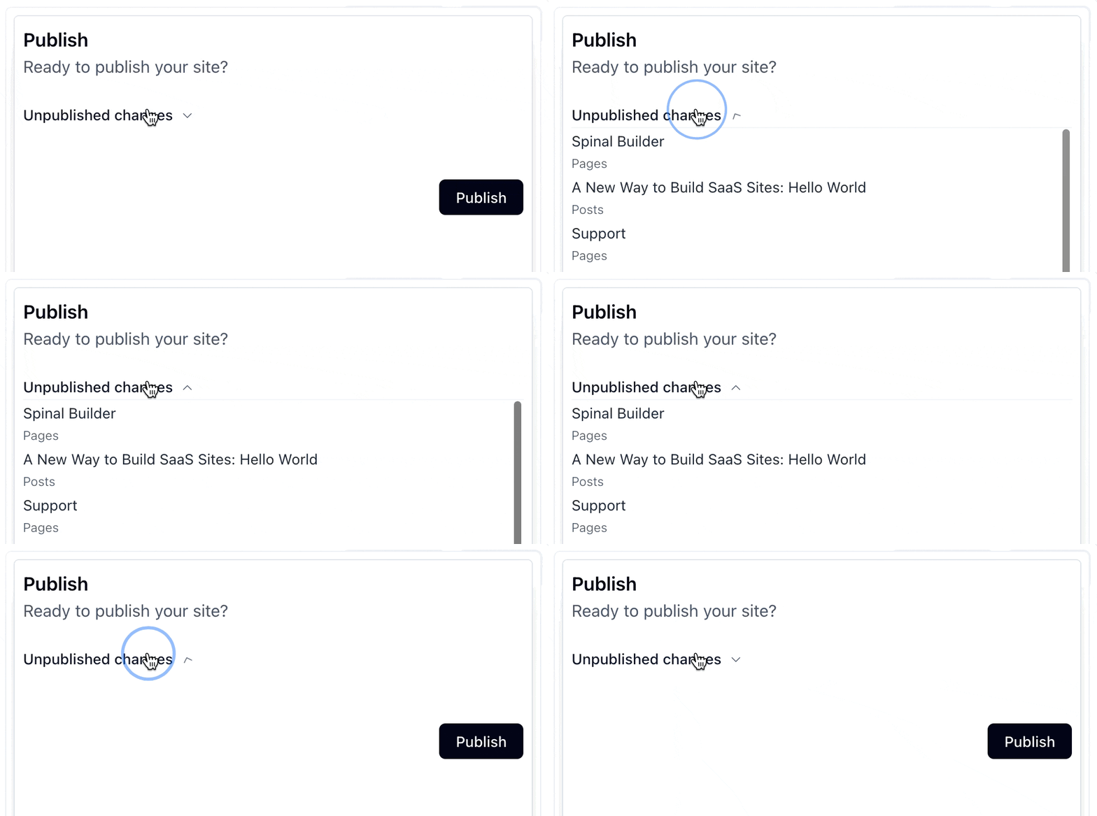
This example is what I am going for. You see it doesn’t have to be the typical FAQ-list style. Using it for sections like this one, works perfectly fine too.

This article goes from:
- the basics;
- to adding visual interest;
- to cool progressive enhancements to using an little-known advanced Stimulus feature.
The basics
The most basic version, looks like this:
<details>
  <summary>
    Show me more
  </summary>

  This is more!
</details>

<details>
  <summary>
    Show me even more
  </summary>

  This is even more!
</details>
And this is how it looks:
Show me more
This is more!
Show me even more
This is even more!
It’s not the prettiest, but it works!
Details/summary attributes
There are a few interesting tricks the details/summary element has up its sleeve.
- open-attribute; you can set this attribute to open one or many elements by default (it’s also used for the CSS below);
- add name-attribute; this allows only one details-element to be open. When you open one, all the others automatically close.
<details name="more" open>
  <summary>
    Show me more
  </summary>

  This is more!
</details>

<details name="more">
  <summary>
    Show me even more
  </summary>

  This is even more!
</details>
Check it out:
Show me more
This is more!
Show me even more
This is even more!
Adding more visual interest
The defaults don’t look all too nice, so let’s add some CSS to make things more in line with your app. The key parts are:
-
[&::-webkit-details-marker]:hidden; this will hide the default chevron; -
group-open/details:rotate-180; this rotates the custom chevron icon based on its state.
The full version with Tailwind CSS would look like this:
<details class="px-2 py-3 group/details">
  <summary class="flex items-center gap-x-2 cursor-pointer select-none [&::-webkit-details-marker]:hidden">
    <span class="text-sm font-medium text-gray-900">
      Show me more
    </span>

    <svg xmlns="http://www.w3.org/2000/svg" viewBox="0 0 20 20" fill="currentColor" aria-hidden="true" data-slot="icon" class="text-gray-600 size-3 translate-y-px transition ease-in-out duration-200 group-open/details:rotate-180">
      <path fill-rule="evenodd" d="M5.22 8.22a.75.75 0 0 1 1.06 0L10 11.94l3.72-3.72a.75.75 0 1 1 1.06 1.06l-4.25 4.25a.75.75 0 0 1-1.06 0L5.22 9.28a.75.75 0 0 1 0-1.06Z" clip-rule="evenodd"/>
    </svg>
  </summary>

  This is more!
</details>
This is how it looks:
Show me more
<svg xmlns="http://www.w3.org/2000/svg" viewBox="0 0 20 20" fill="currentColor" aria-hidden="true" data-slot="icon" class="text-gray-600 size-3 translate-y-px transition ease-in-out duration-200 group-open/details:rotate-180">
  <path fill-rule="evenodd" d="M5.22 8.22a.75.75 0 0 1 1.06 0L10 11.94l3.72-3.72a.75.75 0 1 1 1.06 1.06l-4.25 4.25a.75.75 0 0 1-1.06 0L5.22 9.28a.75.75 0 0 1 0-1.06Z" clip-rule="evenodd"/>
</svg>
This is more!
Progressive enhancements
A toggle event is dispatched on the details-element whenever it state changes. So you could listen for it like this:
details.addEventListener("toggle", (event) => {
  if (details.open) {
    // Do something
  } else {
    // Do something else
  }
});
What can you use this for? For example, store the state in of the details-element in the browser’s localStorage so its persistent throughout. Let’s check it out with a small Stimulus controller:
// app/javascript/controllers/accordion_controller.js
import { Controller } from "@hotwired/stimulus"

export default class extends Controller {
  connect() {
    this.element.open = localStorage.getItem(this.element.id) === "open";

    this.#attachEventListeners();
  }

  // private

  #attachEventListeners() {
    this.element.addEventListener("toggle", (event) => {
      if (this.element.open) {
        localStorage.setItem(this.element.id, "open");
      } else {
        localStorage.removeItem(this.element.id);
      }
    });
  }
}
Need another example? A typcal FAQ-list style can be seen on the pricing page.
That’s how simple it is to add an accordion with plain HTML. You could start really simple, then add some visual interest with CSS and top it off with some progressive enhancements with a simple Stimulus controller.
Want to read me more?
-
Store UI State in localStorage with Stimulus
Easily store user preferences in the browser's localStorage using Stimulus. -
Data-Attributes Magic with Tailwind CSS & Stimulus
Combine Tailwind data state and Stimulus to create usable UI's easily. -
How to Create a Stimulus Toggle Class Controller
A simple to use Stimulus controller to toggle classes on an element. Ready to be copied and pasted into your app.
Over to you…
What did you like about this article? Learned something knew? Found something is missing or even broken? 🫣 Let me (and others) know!
Comments are powered by Chirp Form
{{comment}}