Visual loading states for Turbo Frames with CSS only
When you use Turbo Frames on your page you can set an initial loading state. Something like Loading…. This text then will then be replaced once the request’s body is injected into the frame element. That works great for loading parts of your app asynchronous.
But what if you have a turbo frame element permanently on your page? For example for an overlay or modal component? And what if it is a bit slow? By default it will show nothing (except the progressbar at the top after ~500ms) until the resource is loaded. This makes for a poor UX. Ideally you want to give feedback, even if it is a “loading” text, right away. This is better and tells the user something is happening.
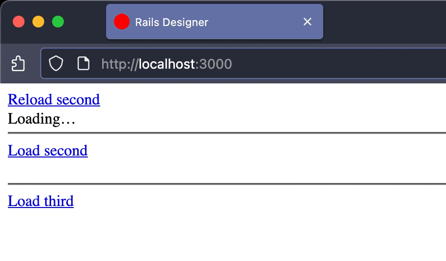
See this GIF:
And compare that to “reloading” the frame again:
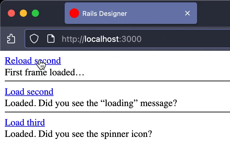
The first version shows no feedback. The last two frames show immediate feedback. I want to show a simple technique I recently used for a client project.
View the repo with all the code here. I added some dummy frame controller that mimics slow requests by setting sleep.
Let’s go over how I approach this.
The standard Turbo Frame loading state
By default, Turbo Frames provides a simple way to handle initial loading states. Content placed inside the <turbo-frame> tag is displayed until the content from the src attribute is loaded and replaces it.
Here’s the first example from the repository:
<%= link_to "Reload first", frame_path(content: "First frame reloaded…", id: "first", sleep: 2), data: { turbo_frame: "first" } %> <br>
<turbo-frame id="first" src="<%= frame_path(content: "First frame loaded…", id: "first", sleep: 2) %>">
  Loading…
</turbo-frame>
This works perfectly for the initial page view. The user sees “Loading…”, which is then replaced. The problem arises when the link_to is clicked. Turbo clears the frame’s existing content and it becomes blank until the new content arrives. This is the flicker of emptiness that creates a poor user experience.
2. A CSS-only loading indicator
To solve this, I leverage an attribute that Turbo automatically adds to a frame while it’s fetching content: aria-busy="true". I can use this attribute as a CSS selector to show a loading indicator that overlays the existing (and now stale) content. This keeps the old content visible and displays a “Loading…” message on top (you can of course completely style it however you want!).
Here’s the CSS to achieve this:
#second {
  position: relative;
}

#second::after {
  content: "Loading…";
  position: absolute;
  inset: 0;
  padding: .125rem;
  display: none;
  background-color: #fff;
}

#second[aria-busy="true"]::after {
  display: block;
}
The #second frame is given position: relative so I can position a ::after pseudo-element inside it. This pseudo-element is styled as an overlay and hidden by default. The “magic” happens with #second[aria-busy="true"]::after. When Turbo sets aria-busy="true", this CSS rule kicks in, changing the pseudo-element’s display to block and making the overlay visible.
A SVG Spinner
A text-based loader is good, but a spinner is often more visually appealing. The principle is the same: use the [aria-busy="true"] state to display a CSS-driven indicator. The main difference is in the ::after pseudo-element’s styling.
#third {
  position: relative;
}

#third::after {
  content: "";
  position: absolute;
  top: 0; left: 0;
  width: 1rem; height: 1rem;
  display: none;
  background-image: url("data:image/svg+xml,%3Csvg xmlns='http://www.w3.org/2000/svg' viewBox='0 0 256 256' fill='currentColor'%3E%3Cpath d='M232,128a104,104,0,0,1-208,0c0-41,23.81-78.36,60.66-95.27a8,8,0,0,1,6.68,14.54C60.15,61.59,40,93.27,40,128a88,88,0,0,0,176,0c0-34.73-20.15-66.41-51.34-80.73a8,8,0,0,1,6.68-14.54C208.19,49.64,232,87,232,128Z'/%3E%3C/svg%3E");
  background-repeat: no-repeat;
  background-color: #fff;
  border-radius: 9999px;
  animation: spin 1.5s linear infinite;
}

#third[aria-busy="true"]::after {
  display: inline-block;
}

@keyframes spin {
  from {
    transform: rotate(0deg);
  }
  to {
    transform: rotate(360deg);
  }
}
Here, the content is empty. The spinner graphic is a data-URI-encoded SVG set as the background-image. The spin animation rotates the pseudo-element infinitely. Just like before, this pseudo-element is only displayed when the frame has the aria-busy="true" attribute.
Make JavaScript your second favorite language
Using Rails Icons
The final example is a refinement of the third. While embedding an SVG in the CSS works, I like to use Rails Icons for my icons (🦉). A cleaner approach then is to use CSS Custom Properties.
First, I pass the icon’s SVG data from the view to the CSS using an inline style attribute on the turbo-frame element itself. I use the rails_icons gem to generate the SVG and then Base64 encode it.
<%= link_to "Load fourth", frame_path(content: "Loaded. Did you see the spinner icon from Rails Icons?", id: "fourth", sleep: 2), data: {turbo_frame: "fourth"} %> <br>
<turbo-frame id="fourth" style="--icon: url('data:image/svg+xml;base64,<%= Base64.strict_encode64(icon("loader")) %>')">
</turbo-frame>
<p>Using <%= link_to "Rails Icons", "https://github.com/rails-designer/rails_icons" %></p>
I opened a PR to make this a first-party feature of Rails Icons; let me know if it is something you like to see merged into Rails Icons).
The CSS is similar as the third example, but the hard-coded data URI is replaced with var(--icon).
#fourth {
  position: relative;
}

#fourth::after {
  content: "";
  position: absolute;
  top: 0; left: 0;
  width: 1rem; height: 1rem;
  display: none;
  background-image: var(--icon);
  background-repeat: no-repeat;
  background-color: #fff;
  border-radius: 9999px;
  animation: spin 1.5s linear infinite;
}

#fourth[aria-busy="true"]::after {
  display: inline-block;
}
And there you have it! It is a technique I have successfully used with various clients now. As a refinement I change the content/style based on loading a frame and saving a form with just some CSS. Let me know if that refinement is something you’d like to see.
Want to read me more?
-
Use cases for Turbo's Custom Events
Many actions from Turbo send custom events before and upon completion. You can use this to your advantage. -
Inline SVG Icons in Your Rails App
Explore the advantages of using SVG formats for icons in Rails apps. Learn how to enhance icon attributes with simple Ruby helpers and integrate any icon library seamlessly. Discover how the Rails Icons gem can simplify your SVG implementation for a cleaner, more adaptable UI. -
10 Modern CSS Features You Want to Use
CSS is evolving quickly and there many really cool new features that can help you craft beautiful web pages.
Over to you…
What did you like about this article? Learned something knew? Found something is missing or even broken? 🫣 Let me (and others) know!
Comments are powered by Chirp Form
{{comment}}