Minimal JS, modern CSS anchored product tours
Ever wondered how to build those interactive product tours that spotlight elements and walk users through your app? Ever wondered how you could with just roughly 100 lines of JS and modern CSS? Wonder now more, I will show and it will look like this:
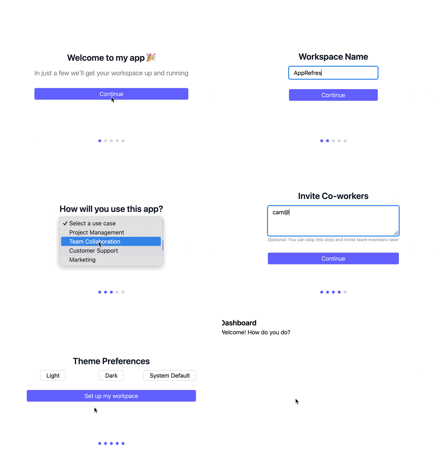
Yes, just around 100 LoC 🤯
I built one using CSS Anchor Positioning and a Stimulus controller. The approach uses two techniques worth talking about: a clip-path spotlight effect (useful in all sorts of contexts) and CSS anchor positioning for the dialog (still very new as of mid-2026).
The full code, as always, is on GitHub.
The clip-path trick
The overlay covers the viewport with a semi-transparent background. But instead of sitting on top of everything, it uses clip-path: polygon() to cut a hole around the target element, creating a spotlight effect.
#clipPath(target) {
  const { top, right, bottom, left } = target.getBoundingClientRect()
  const gap = 8

  this.#overlay.style.clipPath =
    `polygon(0% 0%, 100% 0%, 100% 100%, 0% 100%, ` +
    `0% ${top - gap}px, ${left - gap}px ${top - gap}px, ` +
    `${left - gap}px ${bottom + gap}px, ${right + gap}px ${bottom + gap}px, ` +
    `${right + gap}px ${top - gap}px, 0% ${top - gap}px)`
}
The polygon traces the full viewport boundary, then cuts inward around the target’s bounding box with an 8px gap. A requestAnimationFrame loop keeps the hole positioned correctly during scroll and resize.
This technique works for any overlay-with-a-hole scenario: tooltips, walkthroughs, masking, focus modes.
Anchoring the dialog
The dialog card attaches itself to the target element using CSS Anchor Positioning. No JS position calculation, no ResizeObserver.
[data-controller="onboarding"] > .card {
  position: fixed;
  position-anchor: --onboarding-target;
  left: anchor(--onboarding-target right);
  top: anchor(--onboarding-target top);
  position-try-fallbacks: flip-inline, flip-block, flip-start;
}
The JS sets anchor-name: --onboarding-target on whichever element the current step targets. The card’s CSS declares position-anchor: --onboarding-target, and anchor() functions read the target’s position. The card places itself at the target’s right edge, top-aligned.
If there isn’t room to the right, position-try-fallbacks lets the browser try alternatives: flip to the left, flip above, flip both axes. Each fallback is tested in order until one fits the viewport. No media queries, no JS overflow detection.
As of mid-2026, Anchor Positioning ships in most browsers. Without support, the card renders without anchoring (the anchor() values fall back to auto). The tour still works, the spotlight still works, the dialog just won’t track the target’s position. That’s a reasonable degradation for an enhancement like this.
[!TIP]
Read this article for a great primer on anchor positioning
One small Stimulus controller
One Stimulus controller to get it all together. On connect it creates the overlay and card elements. Each step is a JSON object with an element selector, title, description, and optional image. Moving through steps updates the anchor-name target, repopulates the dialog content, and the requestAnimationFrame loop keeps the clip-path in sync.
It is the kind of Stimulus controller you can drop into any project, update the step data and you have a working tour. The kind of Stimulus controller I like.
The two techniques are independently useful. The clip-path polygon approach works for any spotlight or masking use case. Anchor positioning removes an entire category of JS positioning code. Combined, they make a feature that usually requires a library into about 100 lines of Stimulus.
position-try-fallbacks is a CSS property that I love to see available! ❤️ Overflow handling has always been a JS problem. Now the browser handles it natively. Look for opportunities to use it anywhere you’re positioning elements! 🛝
Want to read me more?
-
A reusable tooltip built with a custom element
Wrap any element in a <tool-tip> custom element and get a positioned, accessible tooltip with almost no JavaScript. No framework required. -
Add a multi-step form/wizard to your Rails app
Adding a multi-step form, for example user onboarding, is really straight-forward to do with Rails. This article outlines a solution that is easy to follow, easy to adapt and tweak. -
Create a Kanban board with Rails and Hotwire
Build a Kanban board with columns and cards with Rails and Hotwire.
Over to you…
What did you like about this article? Learned something knew? Found something is missing or even broken? 🫣 Let me (and others) know!
Comments are powered by Chirp Form
{{comment}}