A reusable tooltip built with a custom element
Custom elements are amazing. They’re a built-in browser feature, not some library you npm install and then hope it will be maintained. You define a tag once and it just works, anywhere and in any framework (and browser). I have talked about them many times before and think they are a great fit for server-rendered apps like Hotwire is (I even added an extension to Attractive.js to make them even awesomer).
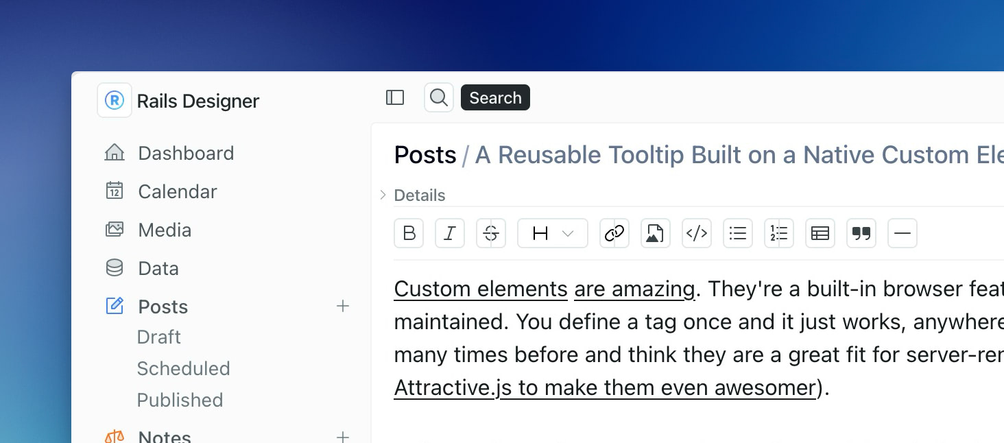
I will use them whenever I need a small, reusable UI behavior. The latest one I used (in my main product) is a tooltip and it’s a good example of why this approach is so clean. 🧼
The usage will show you my point:
<tool-tip label="Search">
  <%= icon "magnifying-glass", aria: {label: "View search"} %>
</tool-tip>
You just wrap any element with tool-tip. That’s it. The label becomes the tooltip text. No Stimulus controller to wire up, no data attributes to memorize or no data-controller noise. Just a tag around the thing you already had.
An important detail (and it actually deserves a separate post!): the element adds display: contents to itself. Why does that matter? Because display: contents removes the custom element from the box tree while keeping its child elements in the normal DOM flow. The extra wrapper will not break your layout, your flexbox or your grid. The <svg> behaves exactly as if the tool-tip weren’t there.
Under the hood, the element leans on the Popover API for the tooltip box. It creates a div, sets popover="hint" and positions it with getBoundingClientRect. The positioning logic is small: it finds the trigger’s rect, centers vertically, places the tooltip to the right and flips left if there’s no room:
let left = triggerRect.right + VIEWPORT_MARGIN
if (left + tooltipRect.width > window.innerWidth - VIEWPORT_MARGIN) {
  left = triggerRect.left - VIEWPORT_MARGIN - tooltipRect.width
}
It also degrades gracefully. If the browser doesn’t support popover, it falls back to the native title attribute.
Now, CSS Anchor Positioning would massively simplify this element. The complete #position method, the scroll listeners, the resize recalculation: it could all collapse into a few lines of CSS if the browser support were there. I skipped it on purpose. Anchor positioning is still too thin on support to rely on (~64% of the level 2 API as of this writing), so the JS stays as-is. When coverage improves, that positioning block is the first thing I’ll delete.
As always, the code can be found on GitHub. It’s a tiny file, and reading it end to end takes less time than this paragraph (okay, maybe not this one, but certainly the previous one…).
Next time you reach for a tooltip gem or package, you could use this custom element instead. Wrap, label, done. 🏁 And keep an eye on anchor positioning, because the day it becomes “baseline wide available” I am going to replace a lot of code. 🧹
Want to read me more?
-
Minimal JS, modern CSS anchored product tours
Build an interactive product tour using CSS anchor positioning and a small Stimulus controller. No heavy libraries needed. -
Conditionally Add CSS Classes in Your Stimulus Controllers
You can cleanup your Stimulus controllers by using a simple vanilla JavaScript function. -
Inline editing with custom elements in Rails
Learn how to build an inline editing feature using custom elements in Rails. A clean, framework-agnostic approach to editable content with just HTML and JavaScript.
Over to you…
What did you like about this article? Learned something knew? Found something is missing or even broken? 🫣 Let me (and others) know!
Comments are powered by Chirp Form
{{comment}}