Variant Configuration
Most component’s variants can be tweaked from the library. This makes it even easier to get the component you need for your app.
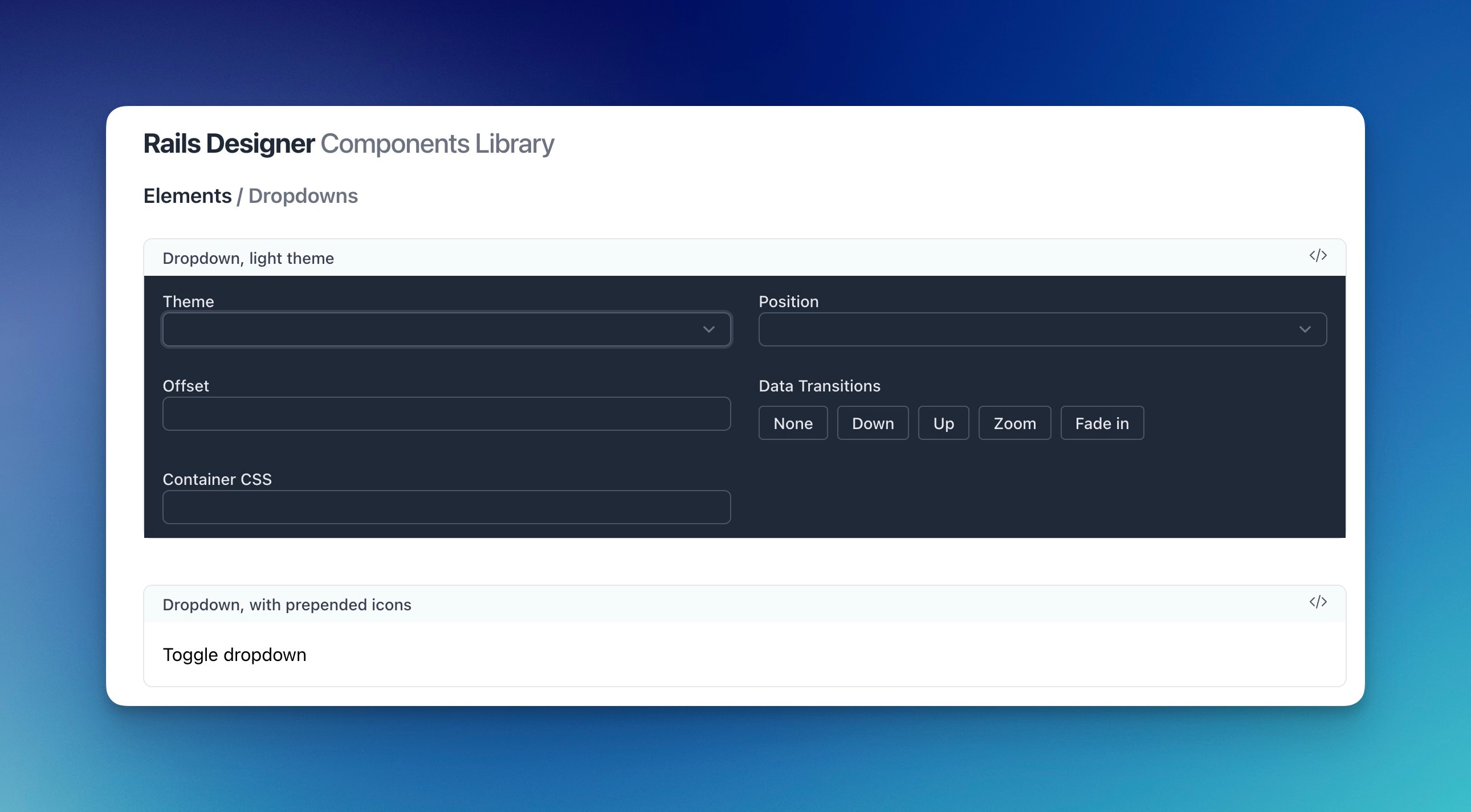
Each Configuration Panel has different options based on the component. They range from the theme (eg. dark or light), position (eg. top, right or bottom), or data_transitions (eg. the enter/leave transitions styles).
Note: Variant Configuration doesn’t change the preview of the component, but changes the code for you to copy & paste into your app!