How to Add Disabled State to Buttons with Turbo & Tailwind CSS
If you’ve used Rails’ UJS, which is now defunct, you probably used the data-disable-with="" attribute in the past. It worked like this:
<%= form_for @post do |f| %>
<%= f.submit "Save", data: { disable_with: "Saving…" } %>
<% end %>
When the form was submitted, the submit button would be disabled and shown “Saving…” instead of “Save”. Nifty! No JavaScript required!
But the world has moved on and is now using Hotwire. Initially, when Hotwire was announced in December 2020, there was no alternative for data-disable-with. But forward to November 2021, button’s submitted “through” Turbo now (prior to turbo:submit-start) get the disabled attribute and it is removed prior to firing turbo:submit-end.
This PR added the option to mimic the previous UJS behaviour. I’d like a bit more control, so I prefer the method outlined here.
That is all you need to show some fancy-pants submit buttons. The PR above shows how you can do it with vanilla CSS. Like so:
button .show-when-disabled { display: none; }
button[disabled] .show-when-disabled { display: initial; }

button .show-when-enabled { display: initial; }
button[disabled] .show-when-enabled { display: none; }
<button>
  <span class="show-when-enabled">Submit</span>
  <span class="show-when-disabled">Submitting...</span>
</button>
Which works great, but my preferred tool is Tailwind CSS, so I can create a component just for a button and have everything contained in one file.
Let’s look how this can be done with Tailwind CSS’ utility classes instead. Let’s use the same HTML from above:
<button class="group/button">
  <span class="block group-disabled/button:hidden">Submit</span>
  <span class="hidden group-disabled/button:block">Submitting…</span>
</button>
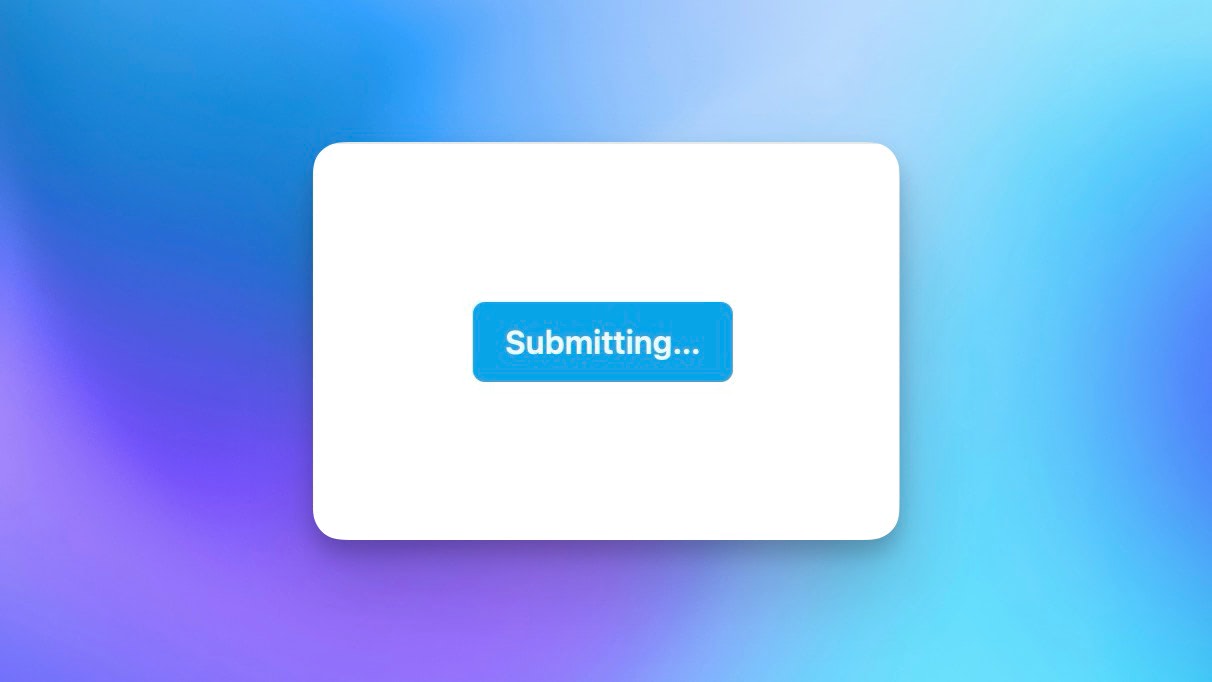
With some extra styles attached the button looks like this when enabled:

And like this with the disabled attribute added:
It works using the group/button (always name your Tailwind CSS’ groups!). Then it’s just using the disabled modifier-utility.
You can have a play with it in this Tailwind Play (try adding the disabled attribute to the button).
You are of course not limited to plain text in the disabled-state, you can add icons, change the style and add transitions.
Check Rails Designer’s ButtonComponent for inspiration. ✌️
Want to read me more?
-
Hidden Gems of Tailwind CSS
Unlock the full potential of Tailwind CSS for your Rails-based SaaS apps with our guide on hidden features. From changing checkbox colors to leveraging peer modifiers and custom variants, enhance your web UIs effortlessly. -
Announcing Attractive.js, a new JavaScript-free JavaScript library
Here is yet another JavaScript framework: Attractive.js. Use JavaScript by writing HTML attributes. -
Conditionally Style Turbo Frame Content
Using a simple Tailwind CSS plugin, you can conditionally style HTML if it's a turbo-frame or not. Allowing you to reuse HTML.
Over to you…
What did you like about this article? Learned something knew? Found something is missing or even broken? 🫣 Let me (and others) know!
Comments are powered by Chirp Form
{{comment}}