Custom Confirm Dialog For Turbo and Rails
With Turbo it is pretty straightforward to customize the browser’s confirmation dialog. Rails Designer’s Components has just released a new set of utilities that includes a custom confirmation dialog packed with three great-looking themes.
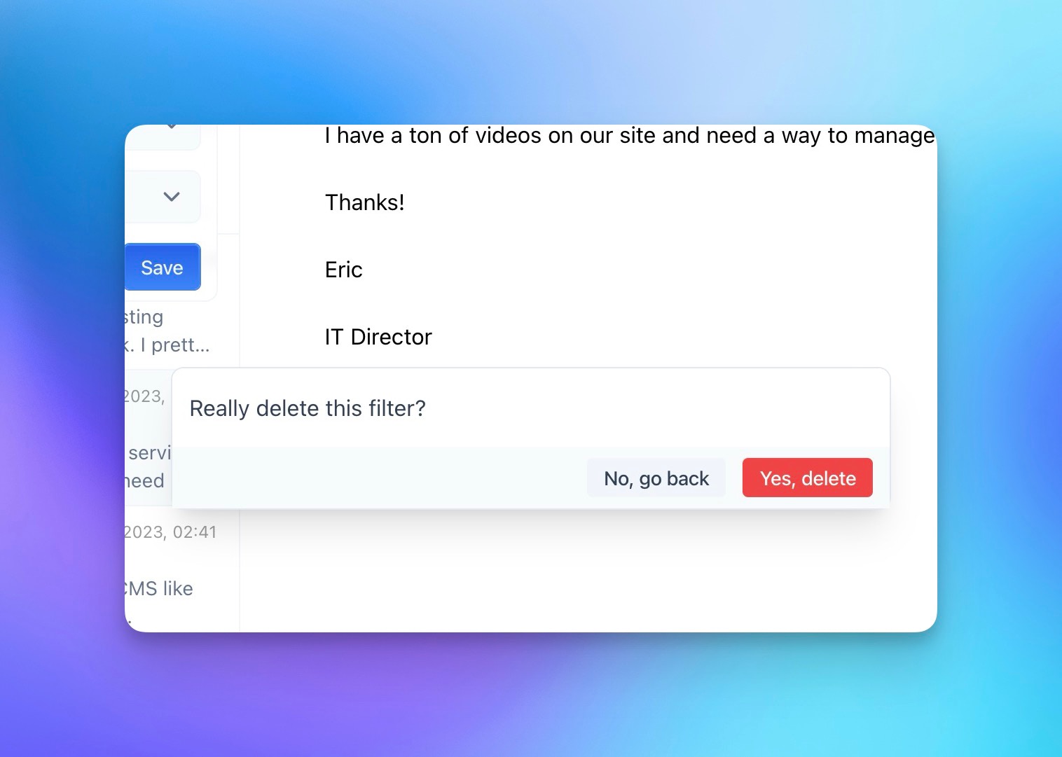
Light Theme
This is the default “theme”. Works well for most apps.

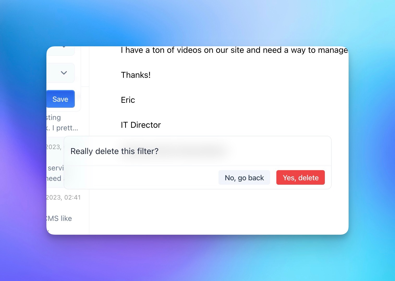
Light Glass Theme
Similar to the light theme, but with a glass-like effect. Subtle, but looks cool with really visual apps.

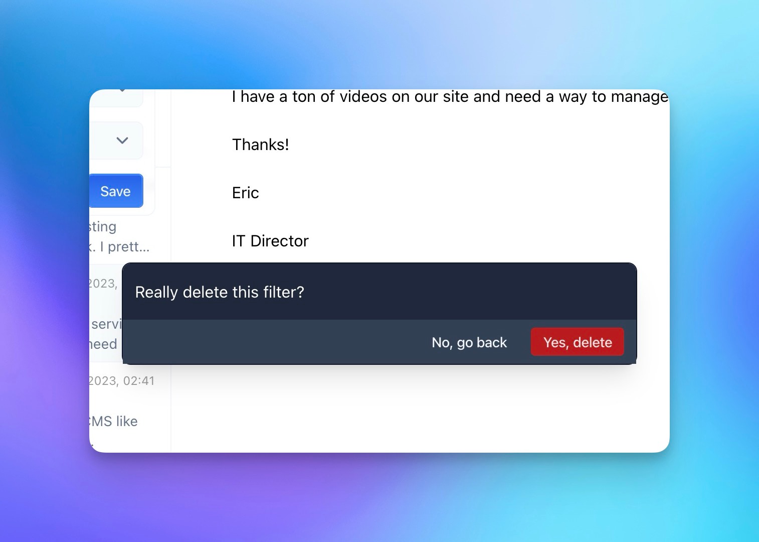
Dark Theme
I like to use dark elements like these in an otherwise light application.

Besides the message, you can also set the confirm and the cancel button labels. This is how you would use it in your Rails app:
button_to "Delete…",
filters_path(filter),
  method: :delete,
  data: {
    turbo_method: "delete",
    turbo_confirm: "Really delete this filter?",
    turbo_confirm_confirm_label: "Yes, delete",
    turbo_confirm_cancel_label: "No, go back",
  }
Adding your own custom dialog is just a few lines of code. First customize Turbo Drive’s confirmation handling, using its new configuration object with a modal that resolves actions based on user clicks on commit or cancel buttons. The once: true means they each are configured for a single use.
// app/javascript/application.js
Turbo.config.forms.confirm = (message, element) => {
  const dialog = insertConfirmModal(message, element);

  return new Promise((resolve) => {
    dialog.querySelector("[data-behavior='cancel']").addEventListener("click", () => {
      dialog.remove();

      resolve(false);
    }, { once: true })
    dialog.querySelector("[data-behavior='commit']").addEventListener("click", () => {
      dialog.remove();

      resolve(true);
    }, { once: true })
  })
}
Previously this used
Turbo.setConfirmMethod, but that has been deprecated.
Then the insertConfirmModal() function could look a bit like this.
// app/javascript/application.js
function insertConfirmModal(message, element) {
  content = `
    <div id="confirm-modal">
      ${message}
      <button data-behavior="commit">Confirm</button>
      <button data-behavior="cancel">Cancel</button>
    </div>
  `

  document.body.insertAdjacentHTML('beforeend', content);
  document.activeElement.blur();

  return document.getElementById("confirm-modal");
}
It inserts a confirmation modal (#confirm-modal) into the webpage and removes focus from the currently active element, returning this newly created modal element.
Of course it needs a bit of styling, but as you can see from above examples you can style it however you want!
Want to read me more?
-
Replace Turbo confirm with native dialog
Upgrade your Rails app's confirmation dialogs from basic turbo_confirm to beautifully styled native dialog elements. Complete control over content and design without custom JavaScript. -
Use native dialog with Turbo (and no extra JavaScript)
Build interactive modals and sliders in your Rails app without writing any JavaScript. Learn how to use the native dialog element with Turbo Frames and Attractive.js. -
How to create Modals with Rails and Hotwire (and Tailwind CSS)
Creating modals in Rails with Hotwire (and Tailwind CSS) is a straightforward process. Let's go through the process step by step.
Over to you…
What did you like about this article? Learned something knew? Found something is missing or even broken? 🫣 Let me (and others) know!
Comments are powered by Chirp Form
{{comment}}